Gaming UX
“If you don’t eat your meat, you can’t have any pudding! How can you have any pudding if you don’t eat your meat?!”
Pink Floyd - Another Brick In The Wall
From a very young age, we’re brought up with a sense of reward. We are taught (rightly or wrongly) by our peers, our teachers and our parents, that “if you do your homework, you can watch TV.” This act of incentivisation is not always beneficial. Kids leave half eaten plates so they can have dessert. But they do instil in us a sense of reward. As adults we take this with us “I deserve this iPhone ‘cause it’s been a hard year!” So we are raised with the notion of reward. If I do this, then this outcome will occur. This is not always a good thing. Instilling a value system like this in kids, if not moderated, can lead to a sense of entitlement and (in some circumstances) a lack of control and respect. At a very young age, this is countered in school by a lack of specific grading. We get a “gold star” or a “v. good” in red biro, but no specific grading. It levels the playing field between “Well done” and “Good work”. This is important as it ensures we are instilled with a sense of self worth and also equality with our peers. We’ve all done a good job so we all get a kind remark. So how is this leveraged in good User Experience design? On the continent, speed radars tell you your current speed and have various ways of telling you when you’re doing it wrong. Above the 50Km speed limit, the speed flashes red, until you get below, where it turns solid green. Others have a frowny emoji face, which turns to a smiley when you are below the correct speed. Others thank you for being below the speed limit and others still tell you the number of penalty points you would lose, if you were caught.
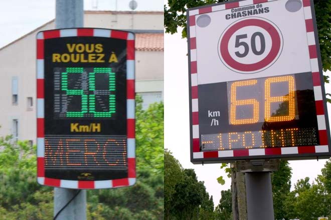
This is an intentional psychological trick. Everyone wants the smiley face, wants to be thanked, and definitely doesn’t want the penalty point. So everyone slows down. It’s effective and saves lives. And it’s technically gaming. The user performs an act which achieves a desired goal. Whether it’s their goal or our intended goal, is what defines how good a user experience we have provided. While browsing online retail giants we are enticed by offers and deals, often for things we don’t want or need, but the value of the offer seems too good to pass up. Retailers have been doing this since time immemorial, and the reason why is because it works. Some would call it duping customers, others would say it’s “good business”. When our goal is to sell, is it not our aim to get customers to buy things they don’t necessarily need?
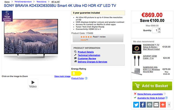
We see offers like the above and buy the TV because we were thinking about replacing ours anyway. We show our friends and say “I saved €100 on this TV!” No you didn’t. You spent €870. Regardless of whether there’s a €100 discount or not, it has still put you out of pocket. Yet we think we have saved, because we’ve been told we have. There’s a very fine line between a blatant sales push and a gentle encouragement to attain some goal. We want our interactions and user experiences to be enticing, not overbearing. Our world is also one now full of notifications. Email, Twitter, Facebook, Facetime, WhatsApp, SMS, LinkedIn, red dot, blue tick, our phones ping and vibrate with alerts to ask us to “LOOK AT ME!!!” They are the ultimate attention seekers. So we click, tap, interact with and succumb to their beck and call. This is their goal, to entice us to interact. Is this a useful user experience? Not necessarily, but it proves how effective they are.
There are those of us who hate to have red dots and unread messages and those of us that don’t care. Either way, whether we acknowledge them or not, they entice us. So what is the point of games? In actual games, be it schoolyard, board or video games, the obvious goal is enjoyment. Sometimes it is to challenge ourselves, like with Chess, Sudoku or crosswords. Other times it is to while away the time and to just enjoy that time. But in any game, there are rules. The more complicated the rules, the less likely people are to adopt. Let’s take the examples of Sudoku and a crossword. A crossword is simple. There are boxes down and across with clues to solve, giving you the answers that go in the boxes. The only requirement is to be literate and to understand the concepts of down and across. Sudoku requires us to understand a slightly more complex set of rules, and looking at a blank Sudoku puzzle, it is not immediately obvious what the rules are. Fill each box with the numbers 1 to 9, placing them in such away so that the lines horizontal and vertical only have one of each number. Even describing it like that, it might not be immediately clear. And there are those who are immediately turned off by the fact it’s anything to do with numbers. “I’m terrible at maths” is the excuse I often hear about why people don’t do Sudoku, even though it has nothing to do with maths.
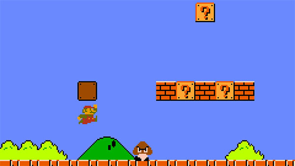
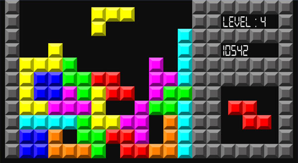
Super Mario Bros. has, what has been defined as one of the best opening levels of any video game. It’s not possible to list all the reasons why here, but Paulo Neto has written an extensive article on how it wordlessly teaches users the mechanics of the game. The key here is “wordlessly”. There is no instruction manual, no guidebook, yet users around the world fell in love with this game and played it, regardless of their language. Similarly Tetris introduced us to a very simple and easily understood ruleset. One of the genius elements of Tetris is the introduction of pre-emption. You are always told what the next brick will be. This encourages the player to keep playing. When you know what’s coming next, you are more likely to already be calculating where you are going to put it, so you are likely to continue.
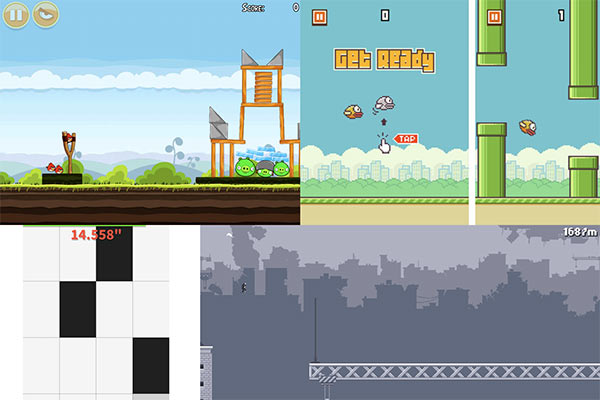
We might decide to play for a set period of time, but the knowledge of what the next piece is keeps us engaged for longer than we intend. Mobile games are the best example of this. The UI and UX are simple, designed to give us simple controls to deal with complex situations. These are time killers, with no real goal, though in the context of Flappy Bird, Piano Tiles and Canabalt, we always want to do better, beat our previous score, go further. Giving us the opportunity to share our current score with our peers on social media goes that step further. We are not only competing against ourselves, but against our friends as well.
There are other more obvious real world applications of games. Fitness trackers are the “apps du jour” with everyone tracking, timing, scoring, mapping and comparing their feats. The nice aspect of fitness trackers is that some, like Strava, encourage you not to like or compete with your connected friends, but to give them “kudos” to congratulate them on their achievement. We all want kudos, so we keep doing our fitness events. My parents (accidentally) bought each other fitness trackers for Christmas. While both said “I’ll never use this”, within a day, they were competing with each other to see who had done better, walked further and done more. Apart from anything, it encouraged them to get a bit active, necessary or not. Achieving the goal of “filling the ring” (do I need to Apple™ this?!) encourages users to reach their goals and gain the added advantage of staying fit while doing it. What does all of this mean for our web design UX?
Effectively it’s about understanding our customers and understanding their needs and what might interest them. The tweet above shows how Ryanair had taken advantage of a current political situation to encourage users to take advantage of cheap flights (this tweet was sent roughly within an hour of news breaking of the UK triggering their Article 50 to commence Brexit). This could be considered good sales rather than good web UX, so let’s look at another example:
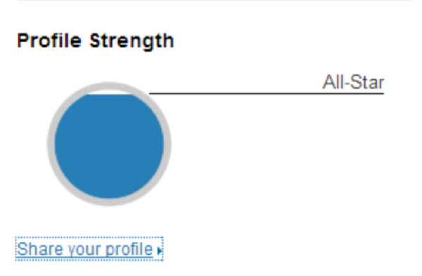
Famously, LinkedIn had (they removed it sometime in the past 6 months) this graphic beside your profile. This was the biggest lie in online social media profiling as the graphic never went to 100%; it was not possible to fill the circle. The fact that this tiny portion of white still existed, meant users would poke and tweak their profiles, aiming to fill the blue portion of the graphic. Many sites use sales tactics, offering 10% discount popup modals on newsletter signup, offering extra discounts on sales prices and offering special gifts. Others entice users to complete signups with the temptation of a reward.
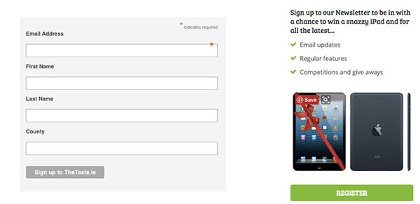
These are two different signups. One is a form and the other includes a call to action. While the first form does enter the user into a competition to win a voucher worth €250 to the website, the second is more obvious in the invitation to enter. The notion of a prize at the end of a task, is always enticing, and is the reason for the success of lotteries the world over. Booking.com (and many other similar sites) use the “coffee stamp” principle of ensuring repeat business. By offering an incentive on a certain number of bookings, I am more likely to book with them again, as eventually I will receive some kind of reward.

When I signed into Airbnb lately to search for a property for a weekend break, I saw a notification (another red dot!) which I investigated. A friend of mine living near me had invited me to befriend him on Airbnb and in doing so, we were presented with an opportunity.
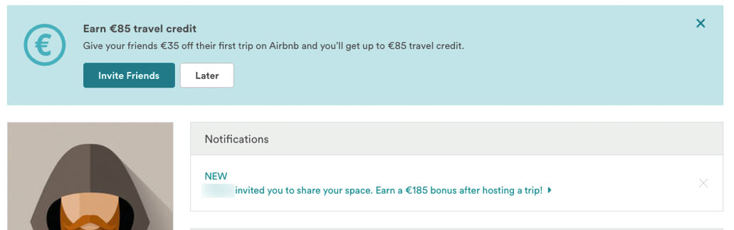
I was invited to join as a property with a space to share. There are a number of interesting points about this incentive. The first is, I make money (based on the travel credit). My friend earns a credit too. I will also make money from letting out the space in my house. But most importantly, Airbnb will make money from gaining me as a customer (based on their percentage of booking fees). The incentive presented here is very attractive and what is best is I didn’t have to go looking for it. I might have thought about letting out a room in my house, but never actively gone to Airbnb to set it up. Here, Airbnb have come to me and said, “Why don’t you do this?” It’s clever and inviting and shows how pre-empting your users needs, and treating your customers as more than just cash cows, can really help grow your business. I also received an email at the end of March from the Munster Rugby Supporters Club, of which I am a member.
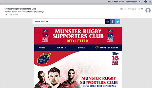
This email is extremely well thought out in more ways than one. First, if you look at the date at the top of the screen, it was sent on Friday, 24th March. Below that you will see the time is 12:44pm. Finally, the subject is “Payday! Renew your MRSC Membership Today!” The fact of the matter is that, yes, the majority of people are paid on the last Friday of the month, so the subject is true. And the email is sent just before lunch time, ensuring that it’s in your mind going into your break that this is something you should do. Does this qualify as good UX? Maybe not, maybe it’s more clever advertising, but it achieves the goal (I renewed that day). So how do we leverage this knowledge into a good user experience?
There are three steps to this process. Step one is to identify your goal; what is it you want users to achieve? Do you want them to sign-up for a newsletter? Download an annual report? Fill in a survey? Submit their candidature for a job? Identify the goal specifically first. If you don’t have a goal, but want greater customer engagement, maybe it would be helpful to create one! Step two is to think from a user’s perspective. What do I want to do on this site? What do I expect to be able to do? Remember that your goals and those of your users may not always align, so how can encourage them to go the extra distance and perform the task you wish.
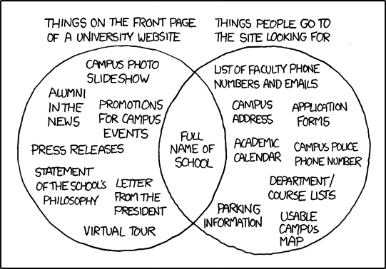
Image copyright XKCD
Step three is identify how easy it is to attain that goal; what are the hurdles to achieving this goal? Does the user need a customer number that they might not have and if so, can they easily retrieve it? Are there too many/too few steps in the process? Are we getting the right information from the user? Adding analytics to your process can help you identify the responses to these questions and simple devices like step indicators (“You are on step 3 of 5”) ensure customers stay engaged, knowing how much or little is left to complete. Inevitably, good UX should be natural to the development and evolution of your site. It’s something that should be considered at all points and if it can be leveraged to encourage our users to stay engaged on our site for longer, then these should be the goals we aim for. We can’t always expect our visitors to use our sites in the way we expect, but if we set them on the correct path, and entice them to complete our goals, then we might find them more engaged than we expected.