Why Accessible Colours Matter
Choices matter - Choosing Accessible web colours without compromising your brand
In today’s digital landscape, accessibility is no longer optional. It’s essential, not just for meeting legal requirements, but for ensuring that everyone, including people with visual impairments or colour vision deficiencies, can engage with your website. Accessible colour contrast is one of the simplest and most impactful ways to make your brand more inclusive.
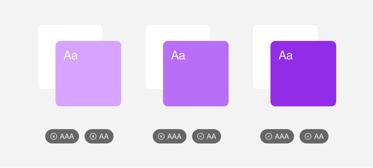
Understanding WCAG: AA vs AAA Compliance
The Web Content Accessibility Guidelines (WCAG) set the standards for digital accessibility. When it comes to colour contrast, they break it down into two levels:
- WCAG AA: Requires a contrast ratio of at least 4.5:1 for normal text and 3:1 for large text (18pt regular or 14pt bold). This is the minimum standard for most websites and is considered broadly acceptable.
- WCAG AAA: Requires a higher contrast ratio of 7:1 for normal text and 4.5:1 for large text. This is a more rigorous standard, often used by the government or high-compliance industries.
While AAA is ideal, many brands aim for AA to strike a balance between accessibility and design flexibility. At Arekibo, we often target the AAA standard as it can be a simple goal to achieve with a more rewarding payoff.
Tips for Choosing Accessible Colours That Still Look Great
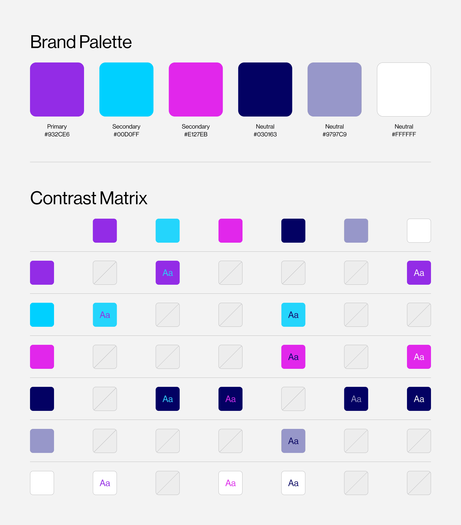
- Start with Your Brand Identity - Begin with your core brand colours and test their contrast using tools like WebAIM Contrast Checker or the ColorZilla Review Chrome extension.
- Build a Contrast-Aware Palette - Develop primary, secondary, and neutral colours that pair well together with appropriate contrast. Incorporate accent colours that are bold enough to stand out against light and dark backgrounds.
- Use Tints and Shades Strategically - If your brand colour is too light for accessible text, create darker shades for type and UI elements while keeping lighter tints for backgrounds or highlights.
- Design for Real Scenarios - Consider how colours interact in UI states (e.g., hover, focus, active), ensuring accessibility and uniformity are maintained across these interactions.
- Test with Real Users - Tools and checkers are great, but nothing beats real user feedback, especially from users who rely on high-contrast interfaces or screen readers.
Example of Brands with Accessible and Elegant Colour Palettes
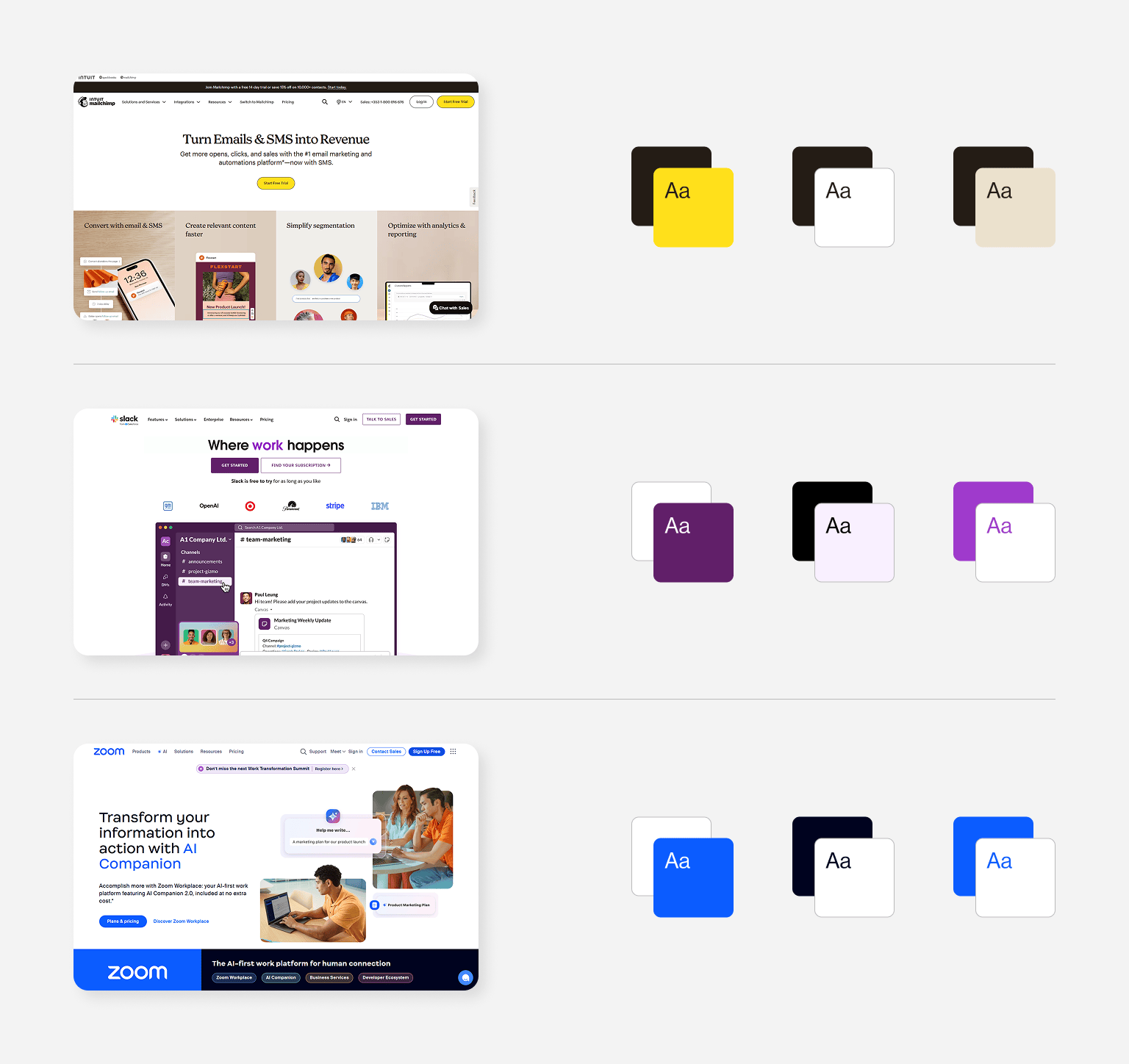
- Mailchimp - Known for its quirky design, Mailchimp still maintains AA-level contrast across most interfaces. They use strong, clear typography and reserve bold colours for call-to-action moments.
- Slack - Balances vibrant accent colours with lots of whitespace and high-contrast text. Their interface makes clever use of colour to distinguish UI elements without relying solely on hue.
- Zoom - Zoom’s interface prioritises function over flourish, using high-contrast text, clear buttons, and minimal distractions. Their use of navy blue and white creates a clean, accessible environment suited to frequent use and varying lighting conditions.
Accessibility Is a Design Strength
Accessibility shouldn’t be viewed as a restriction; it’s a creative constraint that helps you build smarter, more inclusive design systems. By choosing web colours with accessibility in mind, you’re making your brand available to a wider audience while also demonstrating social responsibility and digital leadership.
If you need help creating an accessible brand palette, get in touch with Arekibo to discuss how we can assist you.
/itil-certified-agency.webp?sfvrsn=d838cfa9_1)
/b2b-aiseo-yes.webp?sfvrsn=c1278e05_1)
/cludo-partnershipacfb0690-5725-4ecf-8f12-4ff81435119e.webp?sfvrsn=31f81c5b_1)