The mobile tipping point
As we enter 2020, we reach two interesting milestones in our digital history: first, the iPhone becomes a teenager and second, we reach a decade of responsive design. While these individual events were the birthplace for how the consumption of content has changed over the last thirteen years, reviewing this evolution leads to an interesting view of the future. This future is changing again, and, in some ways, we need to get ahead of the curve and prepare for how the landscape of content consumption is about to change forever.
Consider this: it's January 2007. We're on our daily commute to work. How are we passing the time? Some of us read a book, a magazine, or a copy of the (now defunct) Metro newspaper on public transport. Some of us listen to music on our iPod or equivalent. Some of us send text messages on our ubiquitous Nokia's. Some of us sleep. Though launched in 2006, there is no Twitter on the bus. If we want to check Facebook, we must wait until we are at a desktop computer. This was our morning and evening commute. I know, I did it myself. I started in Arekibo in January 2007 (coincidentally, a week after the iPhone was announced) and with it, ended my necessity to commute to Tallaght from the city centre every day for my previous job. As I could cycle to Arekibo's offices, my commuting days ended but my memory of commuting is locked in that experience.
And so here we are, thirteen years later (I coincidentally publish this post on my thirteenth Arekibo anniversary). I recently stayed with friends in Clonee, Dublin 15 and took a 7am bus for an hour commute into Arekibo in the morning. I watched as pretty much all commuters sat, with heads bowed, over their mobile devices. I thought about the number of hours, of days, of weeks passed, collectively, every morning and evening, online, on busses, trams and trains around Dublin alone. I thought about how when those people get home and tune out of the show they're binging on, to browse their phones. And I realised we've been thinking about this all wrong, we need to change.
But what is "this"? What have we been thinking about wrong? Well, up until now, we have moved with the evolution of technology. The iPhone is introduced (and with it the subsequent arrival of Android devices), and suddenly we can browse websites on our phones. It's hard to define with pinpoint accuracy when smartphones (or mobile devices in general) reached saturation, but it's safe to assume sometime around 2012/2013. Around that time the US market passed its 50% saturation point and the rest of the world quickly followed suit. When Ethan Marcotte released his treatise on "Responsive Web Design" on A List Apart in May 2010, the web design and development community sat up and paid attention. It became the bible, the dictate we needed to follow. Books followed and "responsive web design" became more than an article title, it became our modus operandi. It became something we showed clients we needed to consider and became part of our design and development process.
However, things did not move that quickly. Clients were slow to adopt and adapt, far slower than the industry was moving. Even today, while some businesses recognise that user consumption of their websites is done on mobile devices, they are reticent to put effort into producing responsive or tailored experiences towards those users. The priority is always the desktop presentation, where things like "the fold" and "adding carousels" are still regular conversations to be batted and handled. This is where those businesses are wrong.
As a result of that commute from Clonee, I thought I'd do some research; research I used to do long ago but haven't had cause or want to do recently. While I initially wished to investigate what browsers people were using most these days, I was completely unprepared for the statistics I found. Using StatCounter (an Irish company who have been the world leader in global online use statistics since 1999), I expected to see some wavy graphs with predictable jumps between browsers like Chrome, Firefox and IE. I expected to see Windows top of the pile in OS. I expected desktop to be the de facto browser and window size leader.
Boy, was I wrong.
Charted territory
Let's start with the basics, browser share*. This is pretty much as a web developer would expect, with Chrome the clear leader.
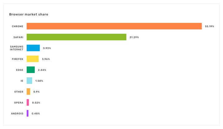
Original Browser Market Share chart on StatCounter
However, here's what caught my eye: the second-place browser is not Firefox as I expected, but Safari. Safari is Apple's proprietary web browser (much like Internet Explorer, or IE, is Microsoft's). That's a lot, A LOT of Safari use. So where is this coming from? Let's look at the OS market share, this chart will help.
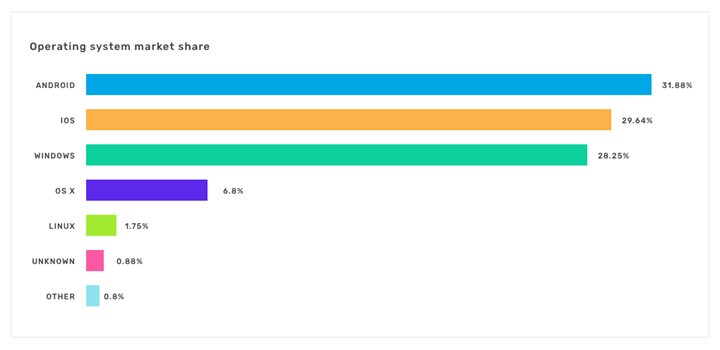
Original OS Market Share chart on StatCounter
And here I had my first "Woah!" moment. I expected to see Windows at the top, I expected to see OSX (Mac) with a much smaller market share, I did not (and don't ask me why because in retrospect, this should have been self-evident) expect to see iOS and Android with so much of the market share. So, going back to our previous graph, it is safe to assume that the Safari use relates in the majority to iOS use (iPhone/iPad) while Chrome use relates in large part to Android (more on this in the next section). Two charts in and things have already gotten interesting.
So how does this relate to actual browser use?
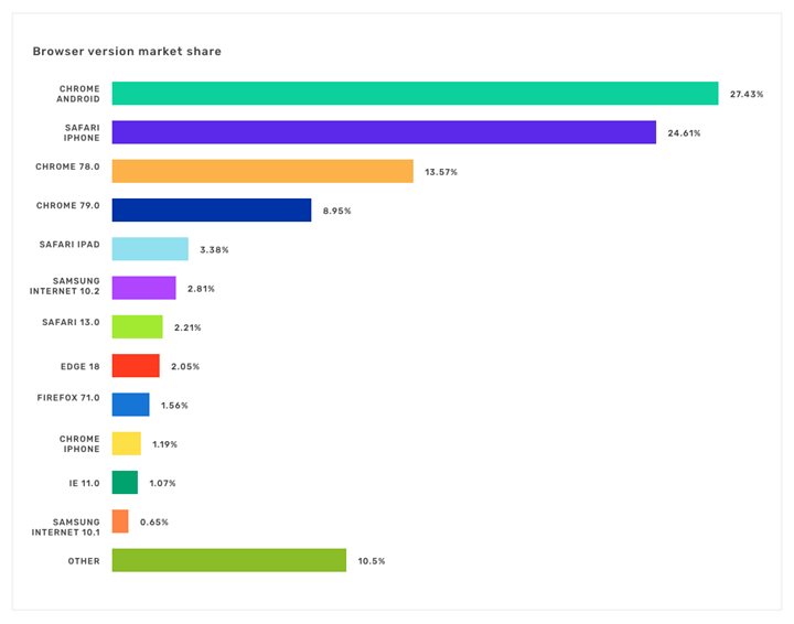
Original Browser Version Market Share chart on StatCounter
The original chart for these stats is a little difficult to read because of the various flavours of Chrome. Suffice to say that, the top green bar is Chrome for Android while the bottom green bar mostly comprises of various earlier versions of Chrome (this is due to their aggressive release cycle of new versions of desktop Chrome. For example, a new version was released at the end of November, explaining the rapid drop in Chrome 78 and the swift rise of Chrome 79). So, of all versions of Chrome, the most popular used (and most popular browser overall) is the Android version. The second most used browser is Safari for iPhone with an aggregated Chrome for desktop third. For info, all other browsers, Safari for iPad, Samsung internet, the latest IE, etc., are all in the bottom 5% of usage.
This tells us the primary browsers being used to access websites as of December 2019 are all mobile based. Curiouser and curiouser. How about comparing them to each other; mobile, tablet and desktop?
.jpg?width=720&height=451)
Original Desktop v Mobile v Tablet chart on StatCounter
So here we can see that, while tablet use is around a steady 5%-ish (even if it dips slightly), a clear divergence between mobile and desktop has occurred in 2019, (it's helpful to view this chart as a whole, to see the progressive change that happened through this past year) which, while slow, looks to be the trend that will continue. We find that nearly 60% of all web access is now done on a mobile device (I would be personally inclined to treat a tablet as a mobile device, but their screen sizes and resolutions these days are that of a slightly older desktop monitor, meaning they are capable of rendering a fully functional desktop site, so here I have bundled them into the desktop bracket. I still believe if this route is to be taken though, more consideration should be made for users whose primary input will be touch). There's a plethora of other statistics that can be garnered from StatCounter but to my mind, this is the one we need to pay the most attention to.
Out of interest, if we look a screen resolution to analyse a little the size of device websites are being accessed upon, we find the following:
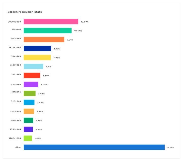
Original Screen Resolution chart on StatCounter
This is lot of numbers, which to be honest, much can be ignored. Let me break it down as:
- 360 x 640 / 375 x 667: Standard iPhone and Samsung devices to date
- 750/720 pixel width: newer iPhone 6 Plus and up, larger Android devices, more recent so less of a market share
- 1366 x 768: standard laptop screen size
- 768 x 1024: table screens
- 1920 x 1080: standard desktop screen size (replacing the older 1024 x 768 standard)
Pretty much all other screen sizes (including the "Other" dotted line) can be bunched together in the "diverse other random smartphone" screen sizes. There's a lot to digest in this chart and I personally feel it's a point of interest worth noting, rather than a factor to get hung up on. The excellent Screen Siz.es website can help us discern the output screen dimensions we wish to target and how we want to specifically tailor work when considering screen resolutions overall. What this chart shows us is that, combined, mobile device resolutions number far higher than those of desktop. This though, is where we arrive at our crux.
What does this all mean?
Let me take you back to my statement "We've been thinking about this all wrong." What do I mean by this singularly undescriptive conjecture?
Up until now we, as developers and designers, have produced work that starts with the desktop. We have focused our website development on the desktop user first. Our designs are shown to our clients on large screens in meeting rooms, often projected onto walls, to illustrate how the desktop user will interact with the site. Our user journeys and user testing are primarily done on the desktop experience. Yet our mobile device approach, our mobile device design, development and interaction, is not always given the same priority. This is not to say that we don't do this work, far from it; it occupies a huge amount of our time, but it is not our lead concern. Our clients want their users to gain the best experience they can of their online representation or their products or their web application from their desktop experience.
However, mobile device interaction is also too often a throwaway remark leaving a meeting room "And this will all work on mobile too, right?" Much like accessibility was treated 10 – 20 years ago, responsive considerations are tacked on at the end and worse, sometimes decided against as "the budget won't accommodate it." There is no defined mobile pathway, and we often come up with this as a result of what is required and decided on desktop as opposed to the other way around. Looking at the statistics above, this is like focusing on tape cassette packaging while the CD market is taking off (if you wish to visit the links under the charts above and change the values to view ten-year figures and how things have changed over the last decade, it's most enlightening). So, in my opinion, it's time to turn development and user centric design efforts on its head.
Mobile first
For a long time, mobile first has been a development ethos. Styling and layout (CSS and HTML) prioritise the mobile experience, to optimise load times and better the user experience on mobile devices. Even if our clients don't ask for it, this is something we do. It's a bit like accessibility; it's not always requested but we know how important it is, so we always endeavour to ensure our work is compliant. I feel though that as users continue to consume content more and more on mobile, that our development approach doesn't need to accommodate mobile interaction, it needs to focus on mobile interaction. The starting point needs to be mobile use, with the desktop being a playground for embellishment. What does this mean? If we consider the commuter on the way to work accessing our client's website, sometimes in this context the required user journey is more targeted, more specific. It might be something as simple as requiring an address, a contact detail or a link to Google Maps so they can find our client more easily. Perhaps our client offers specific services which a mobile device user might need to access more immediately given the context in which they are looking at the site, like flight arrival or departure times. Desktop can become an area where the user can take a more leisurely approach to their user interaction, where our clients can decide user journeys that meander through their offerings and ensure their users visit more of their content.
Mobile does not have to equal desktop
Up until now, mobile has meant creating styles that accommodate the desktop aspects of our client's websites on smaller screens. This no longer needs to be the case and, in fact, very rapidly needs to change. Mobile development should consider the user in context and decide what needs to be presented. What kind of experience is that commuter or binger going to get? What are our mobile user's goals? The questions remain the same, but the context has changed. Surely though this is going to add development time? What about our budget, DEAR GOD WON'T SOMEONE CONSIDER THE BUDGET? Calm down, it's ok, we get it. That's what we do, that's Arekibo's job. We consider the client requirements and work out how we can accommodate the varying contexts of a user's requirements and integrate that into our build process. There's a much bigger picture here and we're here to help you see it.
Caution: Context is Queen
In a talk I gave at 3XE, I mentioned that not only is content King, but context equally so. I arrived at this theory independently, (though Gary Vaynerchuk had already written about it) and another speaker at the same event used the phrase "If Content is King then Context is Queen". This is a bit like the 4th and 5th dimension being Time and Space. They are independent dimensions, but you can't have one without the other, and are hence inseparably entangled. The fact that we all three had this point to make proves how valid it is as a premise.
Defining context applies in very specific ways regarding this specific topic. We have clients for whom we produce internal dashboards, web apps for office use, terminal displays and various UX interfaces that do not have a public target audience. In this context, producing a desktop-only experience suits their requirements. It suits the context. There is no desire to have a mobile experience as our clients know there will be no mobile users (in fact, the actual environments in which these interfaces are used are controlled and limited). In this instance there is no point investing any time in producing a mobile first approach, let alone designs or proposed implementations. They are redundant. However, if you take a client with a very broad audience, like for example Dublin Airport; there we find that this approach is correct and one worth investing time in. Users need access to services on the go, so we work hard to ensure the tools are available to them in a mobile space. Again, every situation is different and has its own context and this needs to be identified as part of the UX process, almost more importantly than the content or the intent.
Understanding this context can make or break a project and is a complex analysis process that is undertaken prior to any design or build work. A healthy blend of visitor analytics, market trend analysis and user research should lead to insights into the direction design and development budgets should take. This in and of itself is a balancing act as studying trends like these too deeply can adversely affect design strategy. As "Zen and the art of archery" teaches, the harder we concentrate on hitting the target, the more invariably we will miss. So, we must find a way to balance the data and analytics with trends and expectations, define them within a context and decide the best strategy to move forward.
Don't worry, I told you, that's what we're here for; we're experts at this!
Scrapping desktop
The question thus arises, are we proposing scrapping desktop? Of course not, this is not at all the premise of this article. However, in looking at the below 50% (and falling) desktop share, we, as developers, designers, digital analysts and UX experts must consider that the future is changing, and we need to change with it. Desktops are here to stay, though what format they will have is questionable. In 2030, how many users' primary desktop experience will be through their home television or entertainment system? What "next big thing" of a games console is around the corner that will shift users to their platform? Will screens even be a physical entity, will users engage in virtual reality "desktops" to perform their daily tasks? Will online shopping be walking around a virtual reality store? Technology is changing rapidly; far more rapidly than I can say with certainty what we are going to be doing in the next decade. But as we enter the new roaring 20's, one thing is for certain: we need to reconsider our users and the contexts of their consumption of content. Technology does not stand still. Even our bodies are evolving to accommodate the way we consume content, so it only makes sense that we start to give serious thought to these same contexts going into the future.
*All charts produced in this article accurate as of December 2019. Links to the original graphs are provided to allow for review through the passage of time since this article was released. All charts are limited to the Irish market as this is Arekibo's primary market, though they are closely indicative of global trends. To view local, regional or global trends for your market, visit https://gs.statcounter.com
Do you have any feedback? Would you like to chat to us about your content strategy? Tweet us @arekibo or contact us today.